


I previosuly made some simple graphs showing the rates of finishing the Transcontinental Race (TCR) on the Overall Results page of this website. Mike Hall (the TCR organizer) recently asked me to do some more complex analyses that turned out to be even more interesting so I describe them here and have added them to the Results page. The three graphs below show:
- The likelihood of finishing each of the first four editions of the TCR given that a rider reaches a certain checkpoint.
- The distribution of finish times in each edition of the race.
- The distribution of the estimated distances ridden per day by finishers and non-finishers.
Drop-out / Scratch Rate
Mike and I had both noticed that very few people dropped out of the 2016 race before reaching the first checkpoint and almost everyone who made it to last checkpoint made it to the finish, so the idea was to see how strong this trend had been in previous race editions. The pattern that we had noticed is shown by the green line in the graph below being slightly S-shaped:
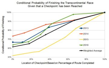

To understand this graph, start by looking at the data points on the far left, which correspond to the start of the race, or 0% of the route completed. These are the simple probabilities that someone will finish the race given that they started. For example, 2014 is shown in red in which 64 of 87 starters were able to finish, so the value is 74%.
The intermediate values are more complicated: for example, the fourth of the six data points on the green line corresponds to Checkpoint 3 in TCR 2016, which was the Passo Giau in Italy at about 42% of the way into the race (about 1600 km ridden out of 3800 km); 158 people reached that checkpoint, of which 138 ended up finishing the race, so the value marked is the “conditional probability” of 87%. How many starters there were or how many dropped out before a checkpoint doesn’t affect the value for that checkpoint (but the values of some previous checkpoints are obviously affected by those things).
The overall average results from all editions of the race are shown by the black line. The straightness of the black line suggests that the drop-out / scratch rate is quite consistent throughout the race with approximately 1% of riders scratching for every 100 km ridden. This rate doesn’t really go up or down much during any specific part of the race when looking at the overall instead of just the 2016 results. Therefore, if two checkpoints are 800 km apart then it should be expected that an additional 8% of starters will scratch somewhere between them, regardless of where those checkpoints are on the race route.
Finish Times
How long it took people to complete each edition of the TCR is shown in the next graph. Medians and percentiles are shown because the distributions are skewed / asymmetric. The median (the central line in each box) shows the time that 50% of finishers arrived before and 50% of finishers arrived after. Four other percentiles are shown to give an idea of the degree of variation. The winning time and the time when the finish party ended are also shown.
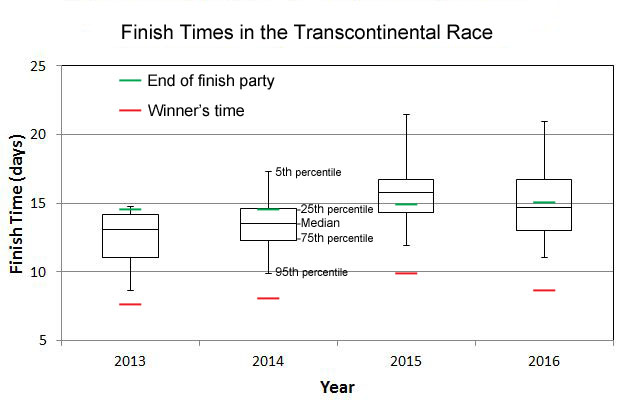

2015 had the slowest winning and average finishing times, but this was mainly due to the route being longer than for the other editions. The final figure below therefore shows the distances ridden per day.
Distance Cycled per Day
The finish times were combined with a rough estimate for the distance ridden in each edition of the race (3300, 3600, 4200, and 3800 km, for 2013-16, respectively) to obtain the estimated distance cycled per day. The format of the following graph is similar to that for the finish times above, except that in this graph higher values are strived for instead of lower values.
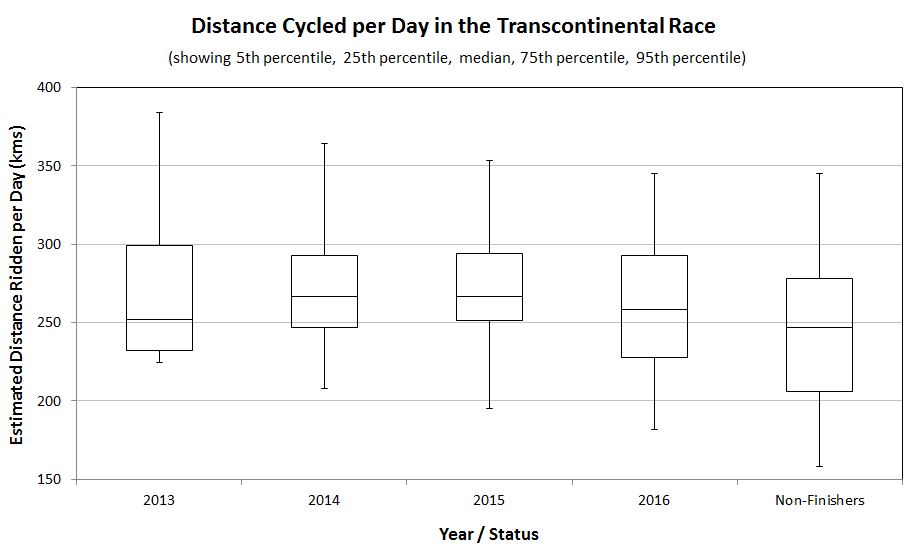

The slightly lower distance ridden per day in 2016 (median = 258 km per day) than in 2014 and 2015 (median = 267 km per day for both) shows the effect of the more mountainous route. The data from 2013 is not very reliable because there were so few racers (the 20 finishers rode a median of 252 km per day). 2016 has the largest amount of variation between individuals, which may reflect the fact that the race has become popular amongst cyclists with a wider range of abilities.
The 2016 and 2017 routes were designed so that someone who averages about 250 km per day should finish in time for the party and this graph shows that the average finisher has always slightly exceeded this rate of progress. Someone who wants to be in the top 25% of finishers probably needs to average at least 300 km per day. Someone who rides more than 350 km per day should finish in the top 5%. Someone who only averages around 200 km per day not only won’t make the party, but also won’t see very many other people on the road after the first few days.
The estimated distance per day for non-finishers is shown on the right-hand side of the graph above. This is based on the times that those people reached the final checkpoint before scratching and the estimated distances to those checkpoints. This data only includes people who reached at least the second checkpoint because speeds to the first checkpoint are much higher than in the rest of the race due to riders being fresh and taking less sleep breaks until that point. The data from all editions is shown together to make the summary statistics more reliable (data is available for 129 people). It’s apparent that a broad spectrum of people scratch from the race, including some people who were on pace to finish in the top 5% before scratching but also many who were doing fewer kms per day than the average finishers.
As mentioned at the start, see the Overall Results of the Transcontinental Race page for a few more results and analyses.